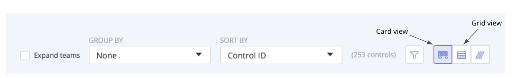
Card view and Grid view
When viewing your controls, you can toggle between two layout options: Card view and Grid view. Use the icons at the top right of the page to switch between them at any time.
Card view
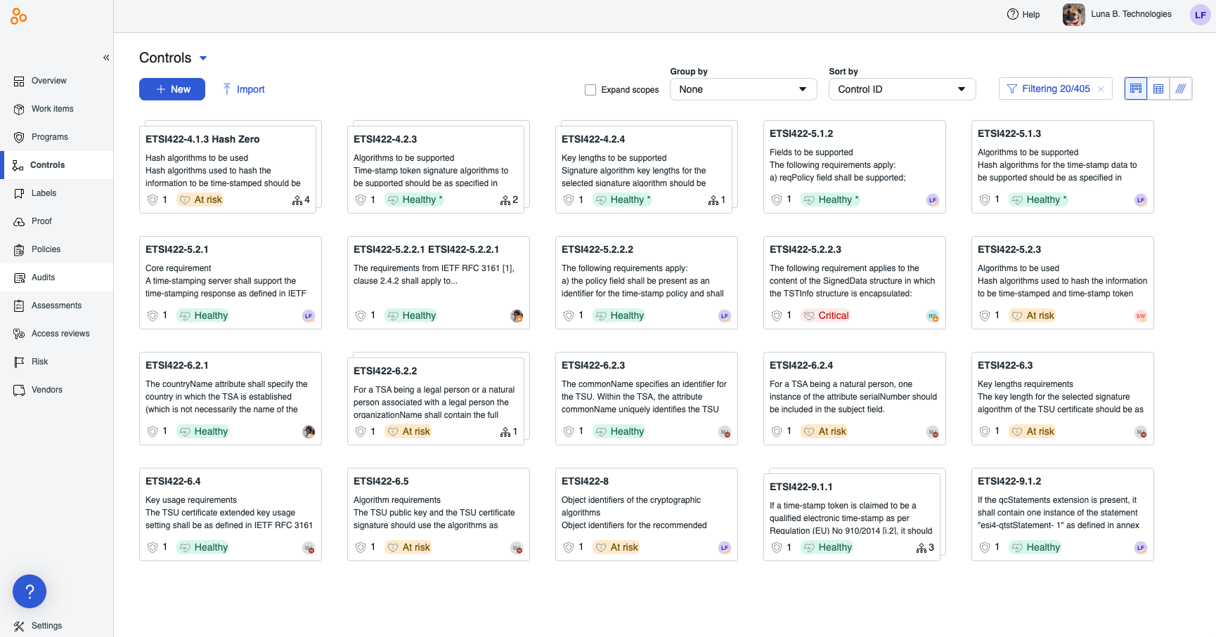
Card view displays your controls in a kanban-style layout. Each control appears as an individual card that shows:
The control name and description
The number of linked requirements
The control owner’s avatar
The control's health status
The hierarchical scopes icon with the number of scoped controls (if applicable)
This view is ideal for visually grouping and browsing controls—for example, by owner or domain.
Grid view
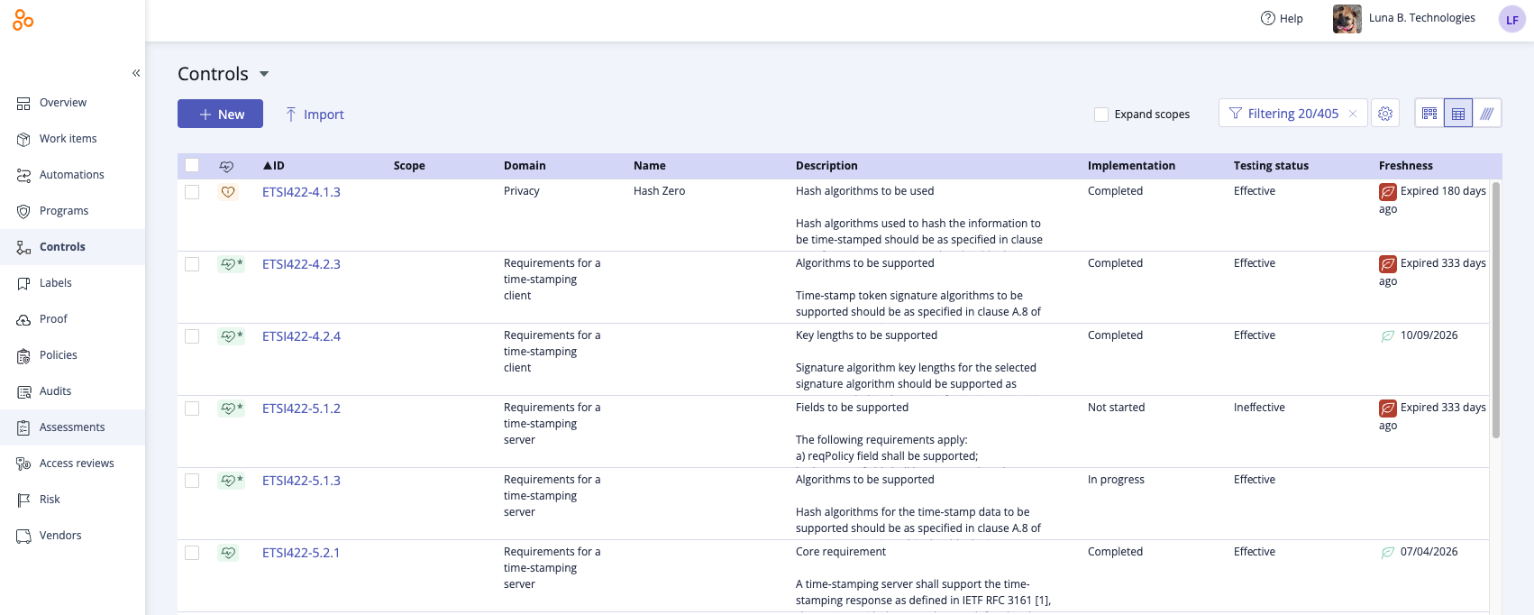
Grid view presents your controls in a table format, with each row representing a single control. Use Grid view when you want to:
Sort or filter your controls by different attributes
Perform bulk actions, such as assigning a user as the owner of multiple controls
You can also customize the Grid view layout:
Resize columns by clicking and dragging the edge of a column header
Reorder columns by dragging and dropping them into your preferred sequence
To reorder, add, or remove columns in Grid view:
Tip
You can include custom fields as custom columns in Grid view for any object that supports custom fields and has custom fields assigned.
While in Grid view, click the Settings icon.
Do one or more of the following:
Drag-and-drop the fields (headers) into the order you want.
Toggle off the fields you don't want to see.
Toggle on the fields you do want to see.
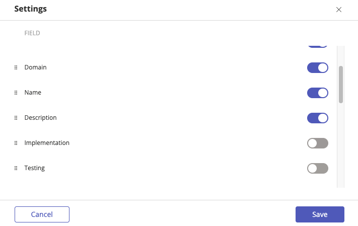
Click Save.
Tip
Grid resizing and reordering works on all Hyperproof grids.